Sunday, May 22, 2011

Chosen Credits-Page


In the end we decided that this was the best version; it is clean and still quirky.

The text in the middle is from Irina Bucsa who wrote it for us with the theme obsessions. I thought it would not look nice with an empty white space in the corner next to our names so I decided to add the text there. It also goes along with the 'storyline' of the newspaper, continuous search for escape.

End page: Credits

We chose our final page to be a "CREDITS PAGE" , to list the names of the people who we have collaborated with and used in our images.


This one I also had to do; I made a few rough drafts but they looked too simple which did not go with the rest of our newspaper, (image 1) then Ioana had the idea to put the words all over the place.


I don't like chaos, so I made an organized-mess credits page. Here are some of the versions, there are changes in the detailing.


To make the newspaper even quirkier and modern we decided to put a tag for mobile-phones to recognize and they can see a message once they scan the code. It says "Thank you for escaping with us". (my phone can't read these things so I'm not 100% sure how they actually work).

Final cover


We chose this one to be our cover because:


- the photomontage doesn't clash with the black typography when the lighter part is up

- The black line goes together with the content of the newspaper where the black line is used as the title background

- it is well proportioned, not too heavy on either sides

- it shows the theme and concept of our newspaper well; the imagery is weird and almost abstract but the title explains the meaning.

Cover design

The cover design I planned together with Ioana since it should reflect both of our input in the newspaper.


Ioana had one photocollage she did not end up using in one of her spreads so she thought it could be used for the cover instead.

We agreed on having a mirror-reflection and I then made various versions of the cover in terms of layout. I played around with the image size, text size, placement and black line.
The imagery and big typo goes well together with the rest of the newspaper.


Tuesday, April 5, 2011

Other Magazine spreads I found inspirational

Out of interest I googled magazine spreads to see what other interesting layouts people have designed for magazine spreads and found a few I liked.

1. Rocketpunch magazine 2. Brandon Perkins, Crop Magazine


I really like the playfulness of the typography and on the first one the overlapping of "Septic death" to the bodycopy. I also like how Perkins made typo into a figure on the second spread. Quite the same idea I did with the Escape spread.

Monday, April 4, 2011

Justifications for Routine spread

After today's tutorial with Rachel and Becky a few questions and comments came up: -

Rationalize why to have the tight text in the speech bubbles


It made me think more about the message that gives out and I decided to still have the text quite tight together because 1) I see the "humans with the cat-masks" speaking in a really fast and squeaky voice. So it's more suitable than having the normal settings for the text. 2) the speech bubbles are for the weird human-cat and should be different from the normal.

- Are the dialogues making people just confused rather than 'confused BUT making them thinking about the message I'm giving out'. How about using text from e.g. Alice in Wonderland or cutting and pasting from two different stories?


We discussed this over with Ioana and thought that the dialogues are suitable - although being weird they are more connected with 'real-life' and the title "Ironic dialogues of routinated people" explains the whole concept of the dialogues. The cats in turn contrasts this with being almost surreal however there's still that routine part of it with the telephone. Which in this case is a symbol for conversations between two people and routine.

Action spread (3rd draft)

After realizing that the margins are going to cut the picture so that it could go to another spread, I added a blank line going through the collage so that it would connect then in the actual newspaper. (Hopefully)

Escape spread (2nd draft)

I started working again on the Escape spread, I thought of adding more words on the top half, more positive-words (to what people want to escape to and feel like.) This would make a bigger contrast since the words 'running' down the glass are really negative. The words also resemble a straw which goes with the cocktail glass. EDIT: Ioana pointed out I should change the words on the lower part of the glass since it seems like someone would "drink the negative words" and should instead be a "potion of things and feelings a person would want to escape to."

...so the upper version has the more positive words "choice,joy,dreams,happiness" against the glass. The potion of escaping dull,boring life. :)

Thursday, March 31, 2011

Work in progress; Escape spread (first draft)

For my escape spread Ioana gave me a story she wrote, it's about dreams and trying to escape the everyday routinated life society has basically become like. Obsessed by time,trends,schedules. This is escaping all of that and doing what one really would want. Following dreams.

Image Hosted by ImageShack.us

The text on the right side of the spread is: 'I’ve taken my decision. I want to run away. I want to run away too, anywhere, just to escape from the room with butterflies in the stomach. Why should I lie down in my tiny corner watching the butterflies fly obsessively around me? Why should I forget the moments of freedom that I had? If I were a piece of paper I would have let myself go with the wind under the door. Even if I dig in the carton walls isolating me from the world outside, they grow again. Is there no way of escape? I want to become an angel. I want to fly away with wings of hope and to get to the factory of dreams. To travel light-years and in my long journey to find new dimensions, new worlds, new beings. To discover the unknown. To pass through galaxies, through new universes. To see so many falling stars so I can remember all the wishes I’ve ever had. To get to the factory of dreams to make them come true, and then come back here, freed from the room with butterflies in the stomach. ' And I made it a staircase shape to represent the steps people take to get to the next place.

I put a cocktail glas with a lemon with the words "boredom,stress,routine" against it to represent initially what most people want to escape to: holiday. Somewhere where time doesn't count, where stress and routines are distant in the memory.


I'm still working on this spread since there's too much blank space however I quite like it still.

Action spread (second draft)

For my routine spread I wrote a 'recipe' for taking action in life. "First and foremost you need yourself. Like making cupcakes taking action may seem difficult at first but in the end it’s not THAT difficult. Remind yourself; do you really want to sit on that scruffy couch and watch your dreams being lived on by invented television personalities? Is that two hour drive to your boring workplace really worth spending time and money on? Would you rather spend time on making cupcakes for living? Perhaps it is, perhaps it’s not. Now to succeed in this recipe you need to know towards what you want to take action to. Start small, you don’t get it perfect the first time (or if you did, congratulations and I am extremely jealous). A mind set of success is vital and the key ingredient. Combined with a positive attitude you can ensure that you won’t quit. Quitting is not part of anything good in life (except smoking). Once you have the goal, make a plan, and follow it, do it! Be careful with procrastination, nothing but silly things are achieved with procrastination. Don’t fear action, you don’t need to sit on that couch and drive two hours every day for the rest of your life. If you don’t really want to of course. I am not the all knowing, I’m just writing a f*****g recipe."

and made a collage out of various photographs;


Which I then adapted together with some flowery-details I drew. One problem is that the newspaper will have a margin of 3cm in the middle so I have to change the position of the collage so it won't cut in the middle. The idea behind this action spread was that people are most often too scared and lazy to do the things they really want to in life and the text gives the factors one need in order to take action in life, i.e. stop procrastinating and start with a small plan and actually do it. The imagery shows various attitudes, sex,drugs n rocknroll, if punkrock lifestyle has been once dream - take action towards it (also, taking action to looking different, not following the trends because everyone else is) then there's a cigarette ashtray and coffee which are part of some peoples everyday habits; taking action to change these habits and so forth.

Wednesday, March 30, 2011

ROUTINE Spread (second draft)

The idea: We had a conversation with Ioana and she talked about dialogues and I immediately had the idea of using dialogues in my Routine spread. The concept I had in mind was a completely random dialogue still dealing with routines in a more abstract way. I started writing down different ones (I used random Finnish names and also put Swedish and Finnish in the conversations to mess it up) Dialogue 1. Mikko: What is she gonna cook for us this time? Yrjö: Really don't care Mikko: Still mad? Yrjö: For missing my daily dosis of Emmerdale?! Mikko: Yes? Yrjö: NO KYLLÄ HARMITTAA Mikko: Common; she'll not be here soon, some kindness perhaps Yrjö: Quite frankly I'd rather go back home and do shit I've been doing for the past 20 years and not travel all this way to see someone I haven't seen in all those years Mikko: Nu slutar du apa dig och övar ditt tal! Dialogue 2. Tapani: red or blue? Sven: green Tapani: too boring! Sven: I am boring Tapani: Today you're not Sven: But I always have the green one! Tapani: Men förstår du inte att grönt inte är skönt? Sven: Fine, I'll pick none Tapani: No ones going to talk to you! Sven: Quite frankly I'd rather pick neither green nor blue and stick to the one I've had always and be laughed at. Dialogue 3. Kalle: WAKE UP! Yrjö: Beer? Kalle: What are you on about? Yrjö: You promised I'd get that morning beer if I get up Kalle: Can't believe this, allright fine... Get up first then I'll give you one Yrjö: You know it's part of my daily routine and I can't live without it anymore Kalle cheated and now their friendship is over. Dialogue 4. T: Come and dance! S: Eh, my leg is broken?! T: Dude, you only live once - besides dancing with a broken leg is much healthier than your ten cups of coffee and two packs of cigarettes per day! S: You want me dead! T: Your habits want you dead sir. S: Right, now I've decided to smoke three packs of cigarettes and twenty cups of coffee AND I'm gonna go and break my other leg as well so see you around... mate. I asked Ioana and another friend to read these dialogues and based on their opinions I chose to include Dialogue 2 and 4 in my spread design.

On the right page I put two of my photographs I took a while ago of my friend wearing a creepy catmask, I added a halftone effect on them (which Ioana and I agreed on to use on almost all imagery) The speech bubbles quote famous songs; "Dude looks like a lady" "Hello,hello baby you called I can't hear a thing" and "Oops, I did it again. Called the wrong person"


This all adds to the weirdness and sarcastic feel we wanted to go for so that are the reasons why I chose to make the design and text this way.

Further developments in the design

After our discussion about the new developments Ioana had a new idea of the tone of voice 'desire to escape' should have: Basically we're going to go more satiric and be more sarcastic about the desires and routines/dreams people have. I got the concept "grass is not greener on the other side" however our tone of voice is more questioning the lifestyles, habits and dreams people have. The imagery would be more grotesque and weird and the text would be more experimental and different on each spread by using dialogues, recipes, creative writing etc. depending on the topic (time,escape,dream,happiness,action,obsession and routine)


We searched for inspirational magazines and Ioana introduced me to TATAIA which had some amazingly inspirational spreads:


Spreads from Tataia.net

ESCAPADE Presentation: Monday 28.3


On monday we had our presentation of the work in progress so far.

The feedback was the following:

- The audience of our newspaper is still quite unclear and it shows in the design

- Next to what newspapers would Escapade be in a store?

- The fonts used; do we want Caslon540 and GillSans because they represent completely different styles i.e. GillSans being more modern and Caslon540 contemporary.

- Do we want our designs to be that different on purpose so when the reader opens the newspaper each page is completely different?


With these comments in mind, me and Ioana had a meeting afterwards and started thinking about the audience,the fonts and the design on a new level.


We agreed on that the audience would be:

young people (18-30 year olds)

cultural/smart

interested in philosophy,arts and creative writing

for those who seek the newest and coolest newspapers/magazines on the market (also sort of underground newspapers)


For the typeface dilemma we agreed to:

Not use GillSans anymore

At first we thought about sticking to Caslon540 but after trying out a few others we found that ITC Officina Serif looks more playful yet contemporary and that's the style we wanted for our bodycopy to be in.

We want a specific font for the headlines/titles, and that is still a bit unsure, but "Monbijoux" would suit the playfulness and weirdness of our designs.

Action spread (first draft)

For my action spread - the initial flatplan idea was to make a diagonal path of steps, so that was the basis for my design. I wrote the text "dare to take the steps" on a foot and made the title "ACTION" really large to cross over the spread.


I added an "extra element" which I painted on plain A4 paper with acryllic paint on the 'O' of action to add something more. On the second version I thought about including a collage of photographs with lines crossing over and under them. I also placed a "note" saying 'pick a route' beside the bodycopy.

Since I was not sure about the bodycopy I just added loremipsum as the text.

Tuesday, March 29, 2011

ROUTINE Spread (first draft)

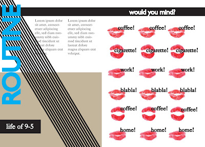
For the routine spread I first made it in colour. I wanted to include a repetitive element and had the idea of a "speaking mouth" saying words that people do everyday = coffee,cigarettes,go to work, talk nonsense, have some more coffee and go home.


The lips I made myself and then scanned them in, I added a halftone effect on them in photoshop. I first wrote the words beside the lips with Gill Sans but it looked slightly dull so I decided to write the words myself and also scanned them in.