Thursday, March 31, 2011

Work in progress; Escape spread (first draft)

For my escape spread Ioana gave me a story she wrote, it's about dreams and trying to escape the everyday routinated life society has basically become like. Obsessed by time,trends,schedules. This is escaping all of that and doing what one really would want. Following dreams.

Image Hosted by ImageShack.us

The text on the right side of the spread is: 'I’ve taken my decision. I want to run away. I want to run away too, anywhere, just to escape from the room with butterflies in the stomach. Why should I lie down in my tiny corner watching the butterflies fly obsessively around me? Why should I forget the moments of freedom that I had? If I were a piece of paper I would have let myself go with the wind under the door. Even if I dig in the carton walls isolating me from the world outside, they grow again. Is there no way of escape? I want to become an angel. I want to fly away with wings of hope and to get to the factory of dreams. To travel light-years and in my long journey to find new dimensions, new worlds, new beings. To discover the unknown. To pass through galaxies, through new universes. To see so many falling stars so I can remember all the wishes I’ve ever had. To get to the factory of dreams to make them come true, and then come back here, freed from the room with butterflies in the stomach. ' And I made it a staircase shape to represent the steps people take to get to the next place.

I put a cocktail glas with a lemon with the words "boredom,stress,routine" against it to represent initially what most people want to escape to: holiday. Somewhere where time doesn't count, where stress and routines are distant in the memory.


I'm still working on this spread since there's too much blank space however I quite like it still.

Action spread (second draft)

For my routine spread I wrote a 'recipe' for taking action in life. "First and foremost you need yourself. Like making cupcakes taking action may seem difficult at first but in the end it’s not THAT difficult. Remind yourself; do you really want to sit on that scruffy couch and watch your dreams being lived on by invented television personalities? Is that two hour drive to your boring workplace really worth spending time and money on? Would you rather spend time on making cupcakes for living? Perhaps it is, perhaps it’s not. Now to succeed in this recipe you need to know towards what you want to take action to. Start small, you don’t get it perfect the first time (or if you did, congratulations and I am extremely jealous). A mind set of success is vital and the key ingredient. Combined with a positive attitude you can ensure that you won’t quit. Quitting is not part of anything good in life (except smoking). Once you have the goal, make a plan, and follow it, do it! Be careful with procrastination, nothing but silly things are achieved with procrastination. Don’t fear action, you don’t need to sit on that couch and drive two hours every day for the rest of your life. If you don’t really want to of course. I am not the all knowing, I’m just writing a f*****g recipe."

and made a collage out of various photographs;


Which I then adapted together with some flowery-details I drew. One problem is that the newspaper will have a margin of 3cm in the middle so I have to change the position of the collage so it won't cut in the middle. The idea behind this action spread was that people are most often too scared and lazy to do the things they really want to in life and the text gives the factors one need in order to take action in life, i.e. stop procrastinating and start with a small plan and actually do it. The imagery shows various attitudes, sex,drugs n rocknroll, if punkrock lifestyle has been once dream - take action towards it (also, taking action to looking different, not following the trends because everyone else is) then there's a cigarette ashtray and coffee which are part of some peoples everyday habits; taking action to change these habits and so forth.

Wednesday, March 30, 2011

ROUTINE Spread (second draft)

The idea: We had a conversation with Ioana and she talked about dialogues and I immediately had the idea of using dialogues in my Routine spread. The concept I had in mind was a completely random dialogue still dealing with routines in a more abstract way. I started writing down different ones (I used random Finnish names and also put Swedish and Finnish in the conversations to mess it up) Dialogue 1. Mikko: What is she gonna cook for us this time? Yrjö: Really don't care Mikko: Still mad? Yrjö: For missing my daily dosis of Emmerdale?! Mikko: Yes? Yrjö: NO KYLLÄ HARMITTAA Mikko: Common; she'll not be here soon, some kindness perhaps Yrjö: Quite frankly I'd rather go back home and do shit I've been doing for the past 20 years and not travel all this way to see someone I haven't seen in all those years Mikko: Nu slutar du apa dig och övar ditt tal! Dialogue 2. Tapani: red or blue? Sven: green Tapani: too boring! Sven: I am boring Tapani: Today you're not Sven: But I always have the green one! Tapani: Men förstår du inte att grönt inte är skönt? Sven: Fine, I'll pick none Tapani: No ones going to talk to you! Sven: Quite frankly I'd rather pick neither green nor blue and stick to the one I've had always and be laughed at. Dialogue 3. Kalle: WAKE UP! Yrjö: Beer? Kalle: What are you on about? Yrjö: You promised I'd get that morning beer if I get up Kalle: Can't believe this, allright fine... Get up first then I'll give you one Yrjö: You know it's part of my daily routine and I can't live without it anymore Kalle cheated and now their friendship is over. Dialogue 4. T: Come and dance! S: Eh, my leg is broken?! T: Dude, you only live once - besides dancing with a broken leg is much healthier than your ten cups of coffee and two packs of cigarettes per day! S: You want me dead! T: Your habits want you dead sir. S: Right, now I've decided to smoke three packs of cigarettes and twenty cups of coffee AND I'm gonna go and break my other leg as well so see you around... mate. I asked Ioana and another friend to read these dialogues and based on their opinions I chose to include Dialogue 2 and 4 in my spread design.

On the right page I put two of my photographs I took a while ago of my friend wearing a creepy catmask, I added a halftone effect on them (which Ioana and I agreed on to use on almost all imagery) The speech bubbles quote famous songs; "Dude looks like a lady" "Hello,hello baby you called I can't hear a thing" and "Oops, I did it again. Called the wrong person"


This all adds to the weirdness and sarcastic feel we wanted to go for so that are the reasons why I chose to make the design and text this way.

Further developments in the design

After our discussion about the new developments Ioana had a new idea of the tone of voice 'desire to escape' should have: Basically we're going to go more satiric and be more sarcastic about the desires and routines/dreams people have. I got the concept "grass is not greener on the other side" however our tone of voice is more questioning the lifestyles, habits and dreams people have. The imagery would be more grotesque and weird and the text would be more experimental and different on each spread by using dialogues, recipes, creative writing etc. depending on the topic (time,escape,dream,happiness,action,obsession and routine)


We searched for inspirational magazines and Ioana introduced me to TATAIA which had some amazingly inspirational spreads:


Spreads from Tataia.net

ESCAPADE Presentation: Monday 28.3


On monday we had our presentation of the work in progress so far.

The feedback was the following:

- The audience of our newspaper is still quite unclear and it shows in the design

- Next to what newspapers would Escapade be in a store?

- The fonts used; do we want Caslon540 and GillSans because they represent completely different styles i.e. GillSans being more modern and Caslon540 contemporary.

- Do we want our designs to be that different on purpose so when the reader opens the newspaper each page is completely different?


With these comments in mind, me and Ioana had a meeting afterwards and started thinking about the audience,the fonts and the design on a new level.


We agreed on that the audience would be:

young people (18-30 year olds)

cultural/smart

interested in philosophy,arts and creative writing

for those who seek the newest and coolest newspapers/magazines on the market (also sort of underground newspapers)


For the typeface dilemma we agreed to:

Not use GillSans anymore

At first we thought about sticking to Caslon540 but after trying out a few others we found that ITC Officina Serif looks more playful yet contemporary and that's the style we wanted for our bodycopy to be in.

We want a specific font for the headlines/titles, and that is still a bit unsure, but "Monbijoux" would suit the playfulness and weirdness of our designs.

Action spread (first draft)

For my action spread - the initial flatplan idea was to make a diagonal path of steps, so that was the basis for my design. I wrote the text "dare to take the steps" on a foot and made the title "ACTION" really large to cross over the spread.


I added an "extra element" which I painted on plain A4 paper with acryllic paint on the 'O' of action to add something more. On the second version I thought about including a collage of photographs with lines crossing over and under them. I also placed a "note" saying 'pick a route' beside the bodycopy.

Since I was not sure about the bodycopy I just added loremipsum as the text.

Tuesday, March 29, 2011

ROUTINE Spread (first draft)

For the routine spread I first made it in colour. I wanted to include a repetitive element and had the idea of a "speaking mouth" saying words that people do everyday = coffee,cigarettes,go to work, talk nonsense, have some more coffee and go home.


The lips I made myself and then scanned them in, I added a halftone effect on them in photoshop. I first wrote the words beside the lips with Gill Sans but it looked slightly dull so I decided to write the words myself and also scanned them in.

ESCAPADE typographic poster design part 2 (first draft)

I continued experimenting and designing the cover (typographic poster) and decided to get rid of the black diagonal line and include more text; with these I was much happier than the ones in the previous post:


The second poster was the final one I really liked. I included to the top part "the story of escapade" which was the idea behind the desire to escape.

ESCAPADE typographic poster design (first draft)

Ioana and I had decided that the word ESCAPADE was going to be spray painted pink through the cutout letters thus coming through to the second cover I started designing, and by only using black and white my first results were the following: 1. 2. 3.

4.


5.


6.


I went for the diamond square shape in the past two however I did not like the result and continued experimenting. For the first ones I made a black thick diagonal line to add more dimension - I thought it would be a good idea to include our spread topics as a sort of introduction to the reader.


The black shapes on poster number 1 and 2 I made with acryllic paint on an A4 plain paper and then scanned in and traced in illustrator.

Typographic Poster Inspirations

Before I wanted to start off designing the typographic-poster cover for Escapade I went to typographicposters.com and searched for inspiration.

These are some of the ones I found most inspirational;


Konsept83


Folk this Town


Jarr Geerligs


Steve Buffoni

S P R E A D T O P I C S

After our lesson on monday the 21st of March Ioana and I realised we can't just start designing individually without knowing the topic and idea behind each spread so we started brainstorming of the idea desire to escape which initially is formed of this principle;

(Ioana's words)

"We are constraint with a cluttered world, imprisoned by the time that’s passing by too fast. We wake up in the morning, have breakfast and a coffee, go to work, go back home, have lunch, watch TV then go to sleep. We are all aware of routine, but still are afraid to be spontaneous and do things we never thought we could. We have regrets, a lot of them, we become obsessed about them, about time and routine. We then close our eyes and start dreaming. We dream, and dream. We start taking initiative and action and try to change, to become happier, have less regrets, do more spontaneous things. We reach the Transient Happiness and enter a world full of happiness. And this is how we then escape."

(and in my words)

"A neverending rollercoaster; life throws at you stones and you either take them or suffer. How can we go on in happiness when everything is always the same and you know what to expect? The routines of the day, routines of the week, routines of the month, routines of the year. Day in, day out you always know what to expect from life, or then you are sure something bad will happen. The dreams during night have become dark and agonizing. The route to awakening is long and difficult, skipping that morning coffee... taking the wrong train, smiling to strangers. The escape can start by small steps. Steps that lead you to bigger ones. Escape is different to all. We know that it is necessary. Dream big, start small, escape routine, escape."

So for the 7 spreads we decided upon these topics:

1. TIME (ioana)
For text: Mircea Eliade, Albert Camus
"We are all constraint by time and the way it passes by so quickly"
Imagery: digital collage with clocks, prison feel
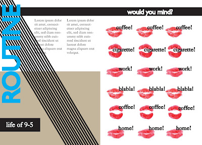
2. ROUTINE (sofia)
For text: poem about routinated life (from a personal point of view)
Imagery: photo collage, halftone Objects: coffee,cigarettes,clock,lips,plate with food - repetition

3. OBSESSION (ioana)
Imagery: type-poster with words from routine, face with text (forming a spiral)
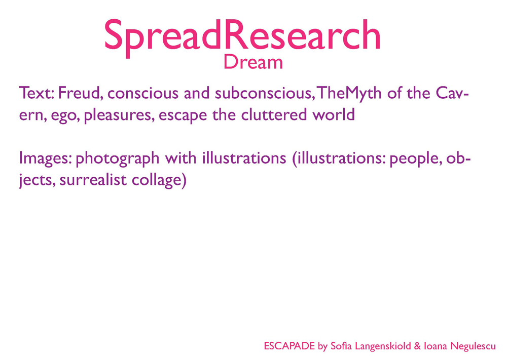
4. DREAM (ioana)
Text: Creative writing; Sigmund Freud (about dreams and dreaming)
Imagery: photograph with illustrations and text/words around the imagery

5. ACTION (sofia)
Text: Taking the initiative to change, poem about change of behaviour and taking action
Imagery: Path with steps, diagonal flow, surrealistic proportions

6. HAPPINESS (ioana)
Text: Happiness, personal philosophies Imagery: smiles, spontaneous, illustration colourful with words

7. ESCAPE (sofia)
Text: Reaching happiness, being able to escape the routinated lifestyle, Utopia
Imagery: Flowy things coming up from the bottom of the page, a new world - "flowery", linked to 'Birth of Venus'

and COVERS (sofia).

Monday, March 28, 2011

T y p e f a c e s a n d c o l o u r s

About a week ago we discussed what typefaces and colours to use in our newspaper design; Ioana introduced me to Caslon which in both of our opinions would really suit the newspaper since the style of it is "bookish" and elegant. Then we wanted another typeface which would fit headlines and titles more and I wanted to go for Gill Sans which is more modern and doesn't have serifs. By deciding on different colours we thought it could be easier for both of us to design and compare our works and also to have two versions, the colour one and then black and white (which the newspaper will be in, in the end.) Caslon 540, Gill Sans Regular and Gill Sans Extra Bold for the cover title For the colours we decided on; pink,orange,neonlime,purple,turqoise and green. (Note: this was the idea and plan from last week)

F L A T P L A N (first draft)


We made this first draft of our flatplan with Ioana very simple and clean because we weren't 100% sure yet about the imagery and text we are using in the end. The blue shapes are for imagery and white area for text, and of course within the areas the elements (imagery and text) can afford the be playful.


All in all we have 7 spreads i.e. 14 pages and the covers, first one being a hardcover made by us separately and then the second 'cover' which will be a typo poster.